 The first thing someone notices about a product is its packaging. For bottled products, the label is where all the information and most the creativity is displayed. When you design a bottle label, there are several things that you should pay attention to in order to improve your sales and attract more customers. The basic components of a label are text, colors, and graphics and all of them work together to make a great design.
The most important thing to remember about the text on the label is to keep it readable. Many fonts are hard to read and if there is any sort of difficulty, the consumer will pass right by your product. This also means that you should pay attention to the size of your text, making sure it is not too small and not too big (so some of it wraps around and out of sight). It is critical to ensure that people passing by can read your entire label.
Another aspect of proper labeling is using words that actually make sense. Pay attention to the way you word your product information on the label. The words should flow smoothly and be easily understood. If your message is not conveyed to the customer, you have lost a sale.
Colors
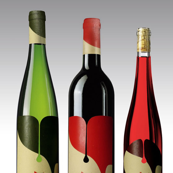
There isn’t a lot you can do with the actual bottle, since they are fairly standardized, depending on what’s going in them. The label is going to be the only colorful aspect of many products. Bright, bold colors are generally a good idea, since they attract attention better than light colors. It is okay to use some crazy and bold colors on your labels since it is such a small part of the overall look. Just remember to stick with your company colors as much as possible though.
The color of the text should be in contrast to the background. If the words are too similar in color or shade to the background, it will be very difficult to read. If you are determined to use light wording on top of light colors, you can use tricks like adding thick, dark outlines to the letters to make them pop off the label.
Graphics and Branding
The most important graphic you are going to put on your product is your logo. Make sure that it is also big enough for people to notice, even at a glance. There are a lot of benefits to highlighting your logo on your label, but it is especially important for building your brand awareness.
When a product first enters the market, the most common mistake is using graphics that are irrelevant. If your product is bottled water, for example, a logical graphic would be something related to nature rather than a random object like a musical instrument. There are many ways to keep graphics relevant, so just be sure that it makes sense.
A Design for Success
While it may seem that rules can be restricting, they are actually great at helping to direct and harness creativity. Have fun with your label designs. This part of the creative process can seem like a lot of work, but it is also very fulfilling. When you pay close attention to the details of the text, colors, and graphics, you can have a great looking label design that will last for a long time.
